Have you ever looked at an image and thought, “something isn’t quite right here”? Maybe there’s a bit too much empty space to the right, or perhaps the subject feels slightly cramped? Well you’re certainly not alone. Composition’s been an issue I’ve had to constantly wrestle with in my own photography ever since I first picked up a camera back in 2013.
Over the past year, however, I’ve made a conscious effort to think about the way I compose a photograph. It’s been an interesting journey, to say the least, and I figured I’d document my findings in the form of a blog post.
Now would be a good time to grab a box of painkillers and/or a cup of coffee because here are my thoughts on the subject (and so begins my slow descent into madness).
The Basics.
It really does help to think about what composition, as a concept, means before heading into deeper waters. In simple terms, it is the arrangement of the visual elements in a scene. The way said elements interact with each other plays a key role in the aesthetic appeal of the image. More on this later.
For now, let’s take a brief look at the most basic compositional tool – the ‘Rule of Thirds’ (ROT) – with an example shot of a Black-winged Kite.
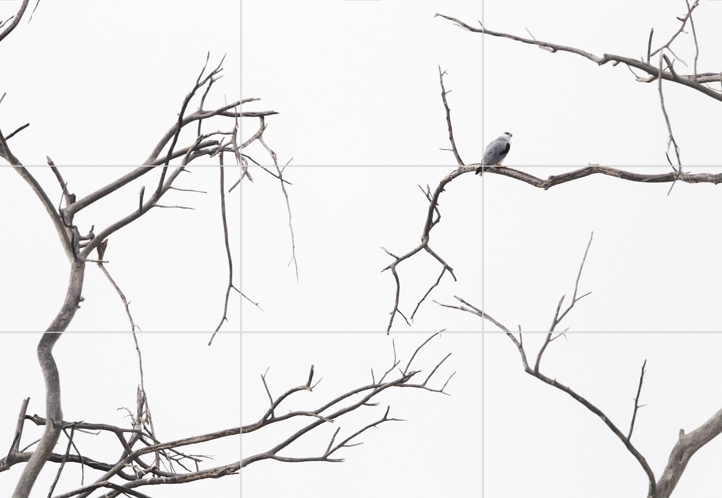
As you can probably see, the Kite is placed pretty much exactly on the top-right Point of Interest (POI), while the other branches either fall on/close to a POI or, at least, follow the lines. What this does is provide a clear direction for the viewers’ eyes to move through the frame. This perceived ‘flow’ is critical, and creates a sense of order in an otherwise chaotic frame. Also, take note of the Kite’s pose as it will be a talking point later in this post.
The ROT, however, does have a major drawback in that it’s quite rigid. If you think about how dramatically scenes can vary and the sheer variety of visuals elements that can be involved, a single, inflexible compositional tool doesn’t always cut it.
Nevertheless, it remains a solid, bare-bones option that has some reasonable practical application.
Spirals and Triangles.
Anyways, let’s now explore a couple of fancier tools, starting with the Golden Spiral.
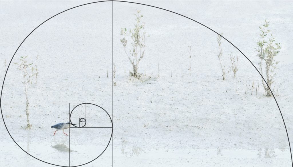
On top of this image of a Striated Heron is an overlay of the Golden Spiral. Composing along the curve, in theory, creates a pleasing flow, leading the viewer to the end of the spiral. In this case, a natural spiral exists in the pattern formed by the Mangrove Saplings, allowing the eye to move freely through the frame. I have to add that, in the field, I did not compose this shot using the Spiral. The fact that the curve aligns the trees and the bird is purely coincidental, and leads us to one of the tool’s major downfalls.
The truth is, you could slap the Golden Spiral onto pretty much any image and make it fit. However, this technique requires a natural spiral to already exist in the scene in order to truly be effective. Proper use of the Golden Spiral demands deliberation and attention to detail. Birds don’t always have the time for that.
Continuing the geometric theme, let’s now explore the Golden Triangles.
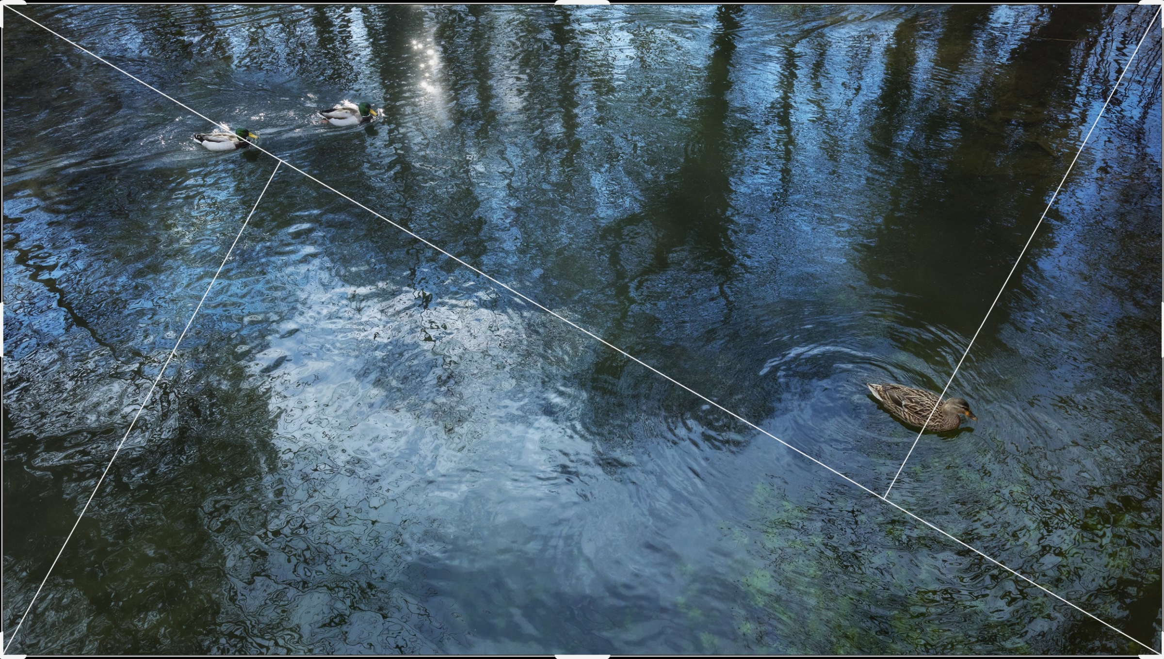
The Golden Triangles are quite interesting. They are primarily used to align diagonal elements in the scene, and positioning the subject(s) along the lines or on the POIs helps create symmetry in composition and adds visual intrigue. Unfortunately though, it is yet another technique I rarely (if ever) find myself using in practice. It seems to be geared more towards architecture, street, and landscape photography where I can see it being very handy.
In the field.
The fact that the composition techniques mentioned above are not always practical does raise a very important question – how does one compose on the fly?
Here’s my very unprofessional workflow.
Most of my compositions in the field are based loosely on the ROT. I aim to place my subjects off-centre with a decent idea of what I want to go for in post-processing. Of course, there’s a massive change in my mindset when I’m shooting lens with a wider focal length as opposed to a super-telephoto lens; I usually am way more careful and deliberate when operating with the former.
Also, why do I use the ROT? Simple – with the press of a button, I can activate the grid in my viewfinder and start composing without delay. When time is of the essence, I just bank on the ol’ reliable and focus on other aspects of image-making. After all, the real fun only starts when I boot up Photoshop.
The Key Element.
Up until this point, there’s a term I’ve held off on using – Balance. To me, it is one of the defining features of an image. A balanced composition distributes the visual weight of the elements across the frame and, sometimes, all it takes is a simple head turn or the position of a tree branch to throw the entire frame off-kilter.
Wilderness.
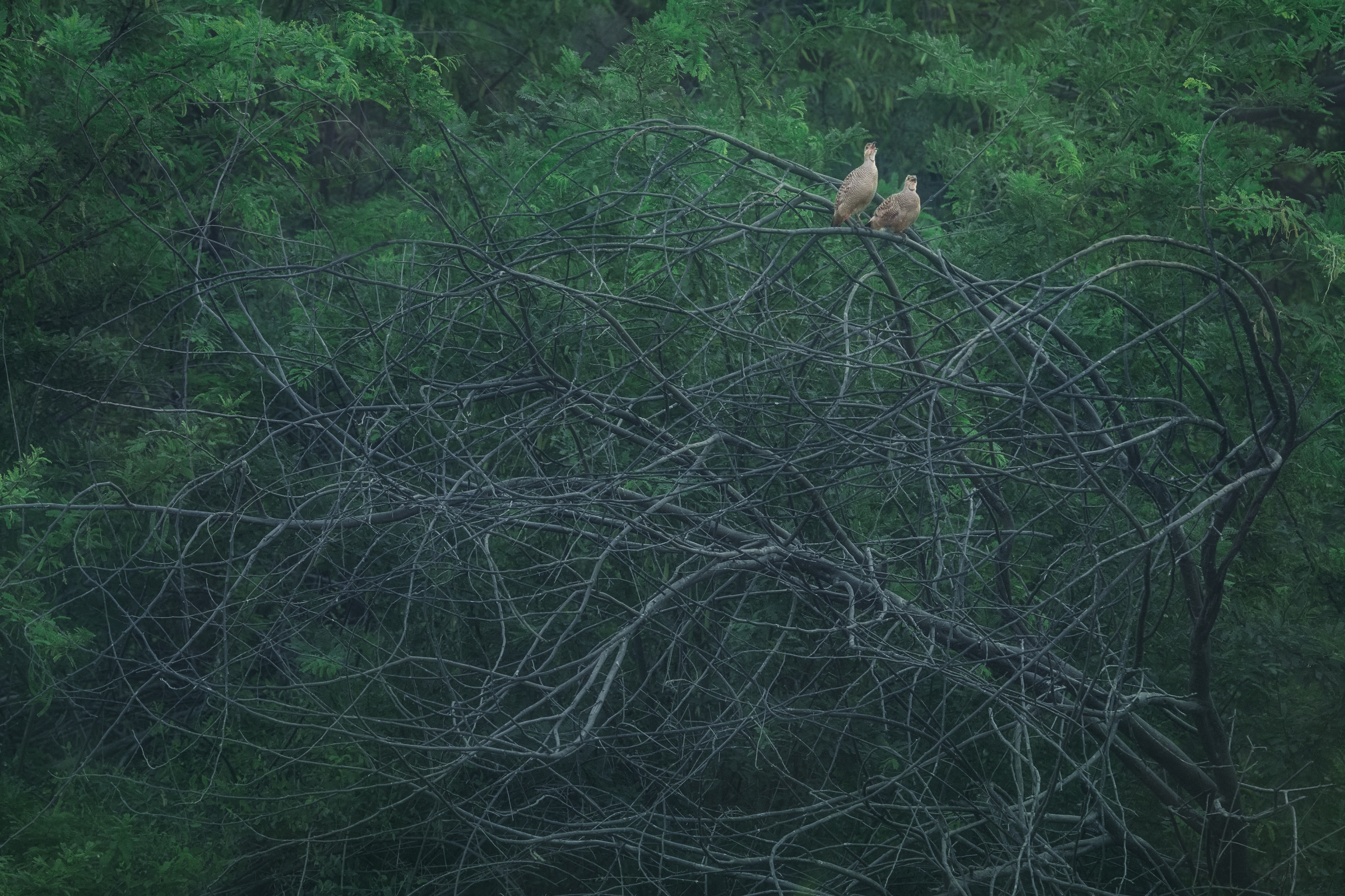
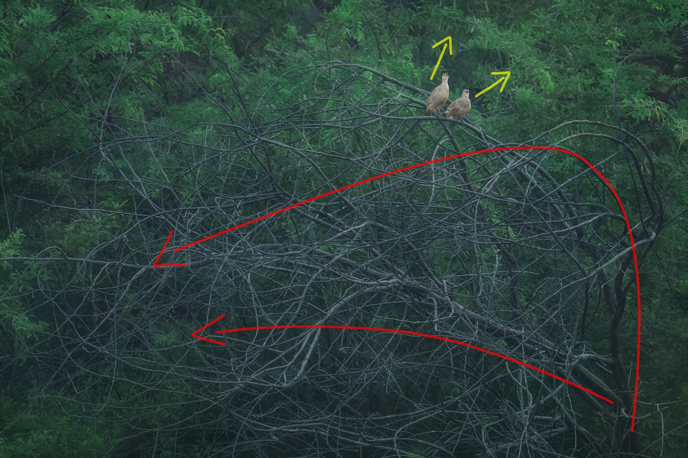
Whenever I load up an image in Photoshop, usually the first thing I look for is balance in composition. Every element in a scene carries weight (visual impact), and the interaction between these elements creates a see-saw effect where the aim is to achieve equilibrium. Here’s an example to better illustrate this concept.
I would encourage you to take a couple of minutes to take a look and decide for yourself whether the image above is well-balanced or not. There are no right or wrong answers. The goal is simply to consciously think about the composition. I’ll share my opinions below.
Personally, I do find the image to be balanced. While the dark, gnarly branches originate at the bottom-right corner, they lean quite heavily towards the lower-left half of the scene. The Francolins serve to act as a counterweight to the branches by projecting their weight towards the lighter top-right corner. This helps add some interest to that region. If the birds were angled towards the left or, say, were absent entirely, this image would feel slightly unbalanced.
A Tale of Two Trees.
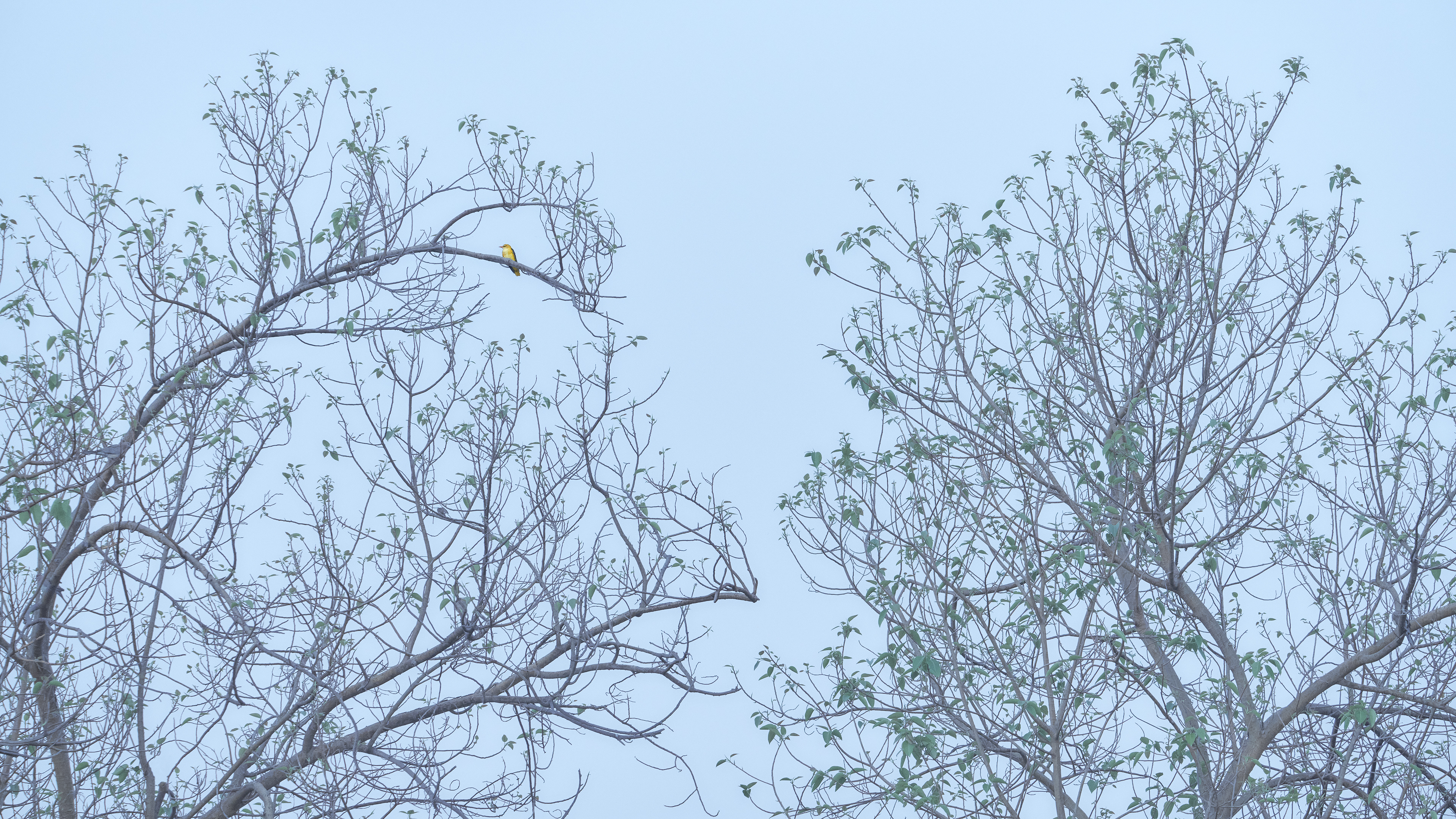
Here’s another example. This image of a Golden Oriole on a misty morning is a relatively complex composition. Let’s take a closer look.
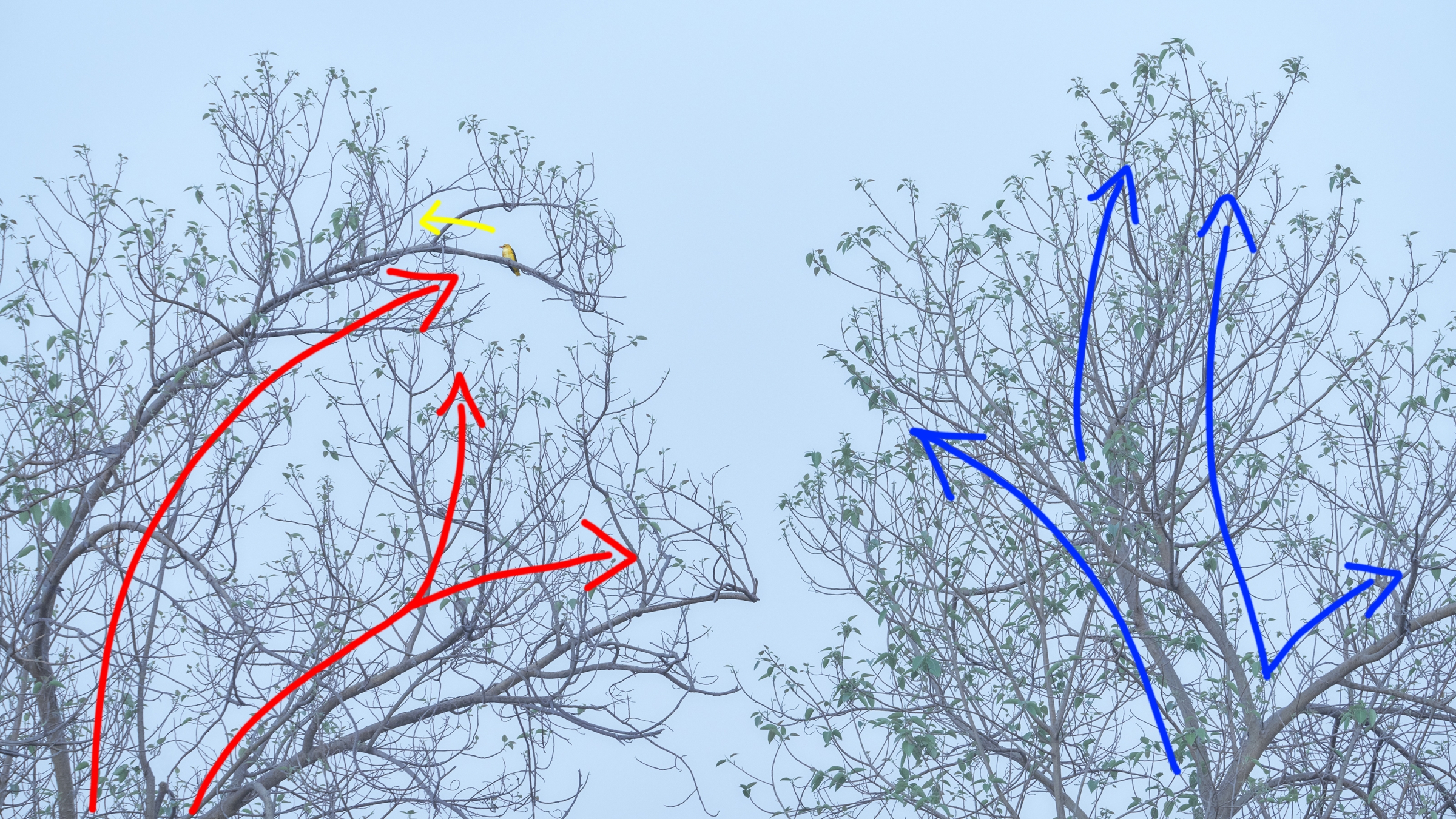
As before, taking a few minutes to dissect the composition can be a very helpful exercise. Take note of the flow of the major branches between the trees. I’ll elaborate on my thoughts below.
Clearly, a lot of good fortune was involved in the making of this shot. Let’s talk about the tree on the left first. It is rather bare, allowing the shapes of the branches to stick (*wink wink*) out more. The red arrows show that two of the three major branches flow towards the right, and one towards the main subject (which we’ll ignore for now). Moving onto the tree on the right, you can probably see that it’s somewhat dense and the flow of the branches isn’t quite as apparent. The blue arrows help highlight some of the major branches which, as it turns out, lean a fair bit towards the right. Again, if the bird were absent, I imagine this shot would be ever-so-slightly right-heavy.
But speaking of birds, it’s time to address the bite-sized elephant in the room – the Oriole’s pose. Traditional bird photography convention suggests that the bird should look ‘into’ the frame. The problem with that approach in this case would be that it would only further add weight to an already right-heavy composition (think see-saw). The Oriole’s more unconventional, looking-out-of-frame pose, in contrast, has a couple of significant benefits. The first is that it acts as a ‘circuit-breaker’ by cutting the flow of the branch directly below the bird, allowing the eye to rest on the main subject. The balance provided by the bird’s pose also allows the tree on the right to act as an anchor, solidifying the overall composition.
Disruption.
If you think back to the shot of the Black-winged Kite from earlier, you’ll notice that it follows the same ‘circuit-breaker’ concept as the Oriole image. The raptor’s pose strikes a stark contrast with the flow of the branches, allowing it to stand out within the intrinsic chaos of the scene. This principle could also be applied to the photograph of the Grey Francolins, where the birds help disrupt the path of the left-leaning burnt branches.
The beautiful thing is that are many different kinds of circuit-breaker compositions. In a scene that begs for change, all you need to do is find a disruptor.
Diagonals are a great way to spice up a scene that consists primarily of vertical or horizontal lines. The dominant line in this frame is the tree that the subject is perched on, while the vertical trees in the background provide some nice depth and balance to the image. This shot wouldn’t be nearly as attractive if it weren’t for the massive leaning Date Palm.
Emotions and poses can be very effective disruptors too. In this image, the yawning Silverbill on the left carries more visual weight than the rest of the group. This helps draw some weight away from the right, lending balance to the frame as a whole. Colours and tonality can also be valuable compositional elements. The dark red leaves stand out against the lighter yellow-green background and, as such, help add substance and interest to the left and the top of the frame.
Wing it.
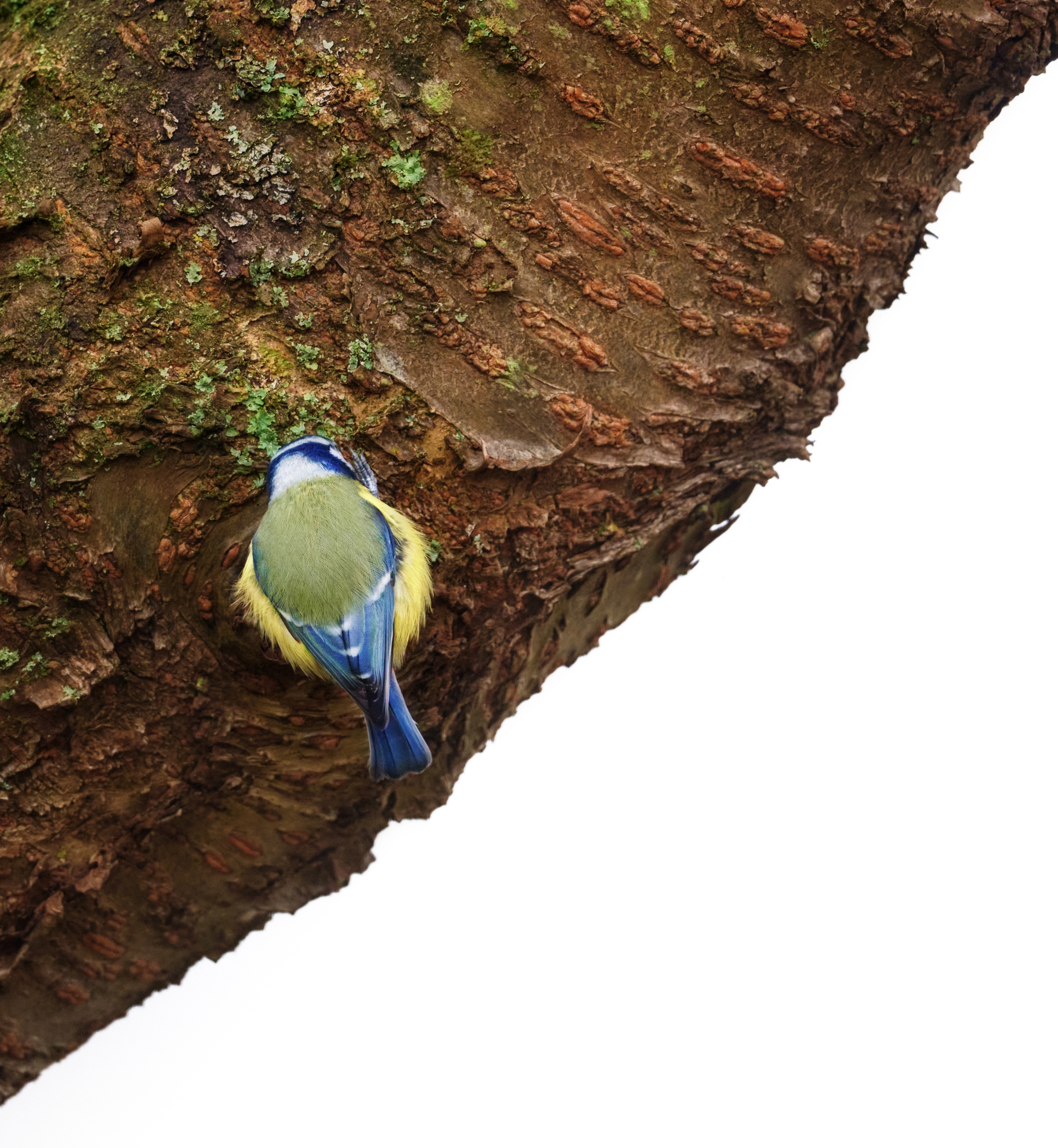
Of course, no guide is complete without the obligatory ‘Break the Rules‘ mantra. It is especially true in the case of composition, which is a highly subjective topic. There are no rights or wrongs, and to think in terms of absolutes is to limit your own creativity. The important takeaway is to learn why some of the established guidelines exist in order to, then, successfully go against the grain.
Visual imbalance can, at times, be just as effective as perfect symmetry. In this half-and-half composition, the rich colors and textures on the left pop against the clean white negative space on the right.
In conclusion.
Photography, as an art form, can be incredibly complex and intimidating. Once you scratch the surface, however, you’ll start to discover a whole new world of possibilities. It is a never-ending journey of learning and experimentation, studded with success and failures.
Personally, I do find myself overthinking and doubting many aspects of my own photography on a regular basis. That tendency is, perhaps, reflected in this rather lengthy post. Over time, however, I’ve managed to come to terms with the fact that compositions don’t always need to make obvious sense. They just need to ‘feel‘ right. That, to me, is one of the many mysteries of this wonderful art form.
As always, thank you so much for reading and I hope you got something useful out of this post. It was a very exciting subject to explore and discuss. If you have any questions regarding photography, please feel free to contact me via e-mail or send me a DM on Instagram (@aditya.sridhar). Stay safe and I’ll see you in the next one very soon!




This was a very good read Adi, for me ROT works best for bird photography due to the way I’m trying to photograph them but there are times where I play around without any grid lines to just to see what visually pleases me and go with the flow. So this was indeed some thought provoking read. I play with different crops more than the composition tools, so now I’ll try the latter.
Author
Thank you so much for the kind comment, Bhumit! Playing around with no grids is certainly a great way to train your creative muscles. I’m very glad you got something out of this blog post 🙂
Awesome, fabulous, fantastic, brilliant.. You find and fill the adjectives from the dictionary.
Loved this blog A! ROT is my go to…however I’m always looking for different ways to improve or change composition. You’ve given me some new tools to think about…
Author
Thanks so much for the kind comment, B! I’m so glad you found this post useful! 🙂